
LONDON HEALING THERAPIES
DESCRIPTION
Concept, Logotype, Art Direction, 3D, Motion.
London Healing Therapies is a project focused on restoring body balance, relieving tension, and promoting physical well-being through personalised treatment.
My objective was to create a new brand identity that visually expresses the clinic’s core values: care, precision, and movement through a minimalist and contemporary aesthetic.
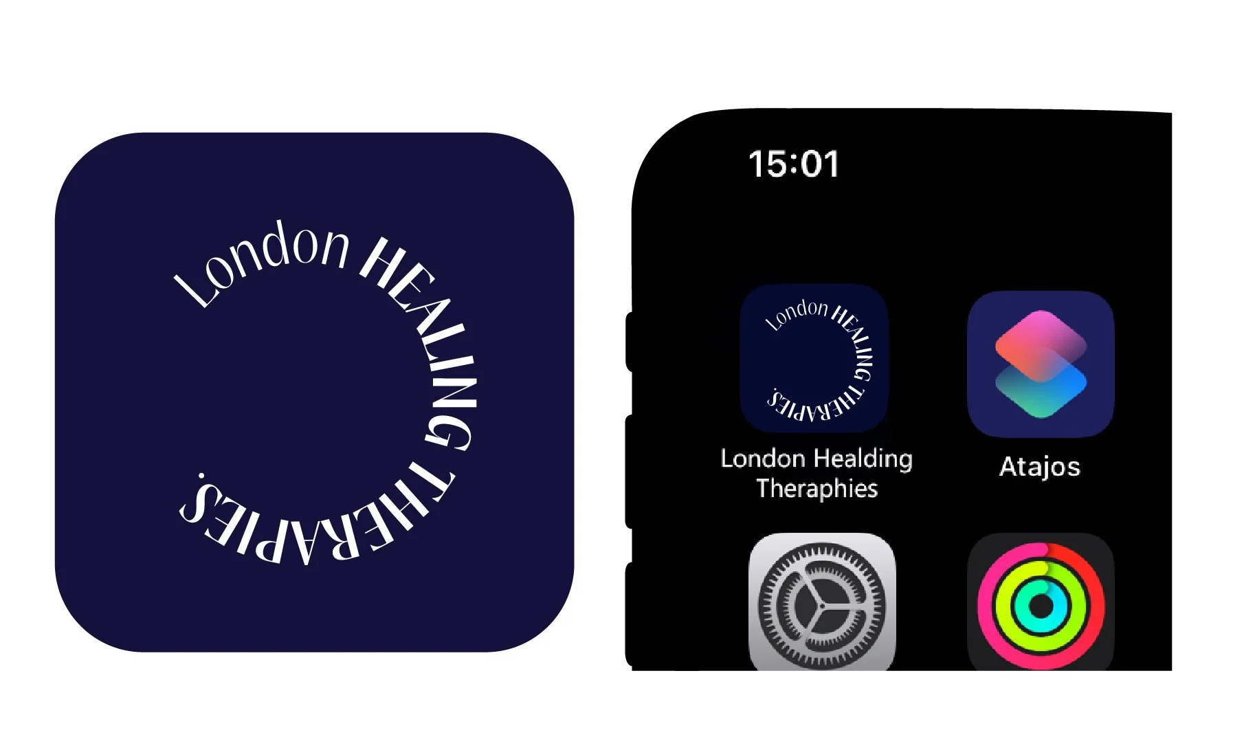
Logotype

The art direction builds on the clinic’s dual nature: scientific and human, technical yet warm.
The colour palette is soft neutrals (white, grey, beige and navy blue) evoke calmness and trust, while subtle accents of warm red or blush recall skin tones and the inner body.
The typography, a clean sans-serif font system, reflects clarity and professionalism, combined with refined spacing to evoke breath and relaxation


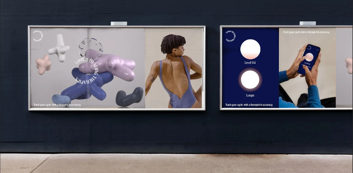
The visual language is minimal, structured compositions echo the balance of the human body, while organic forms introduce motion and tactility.
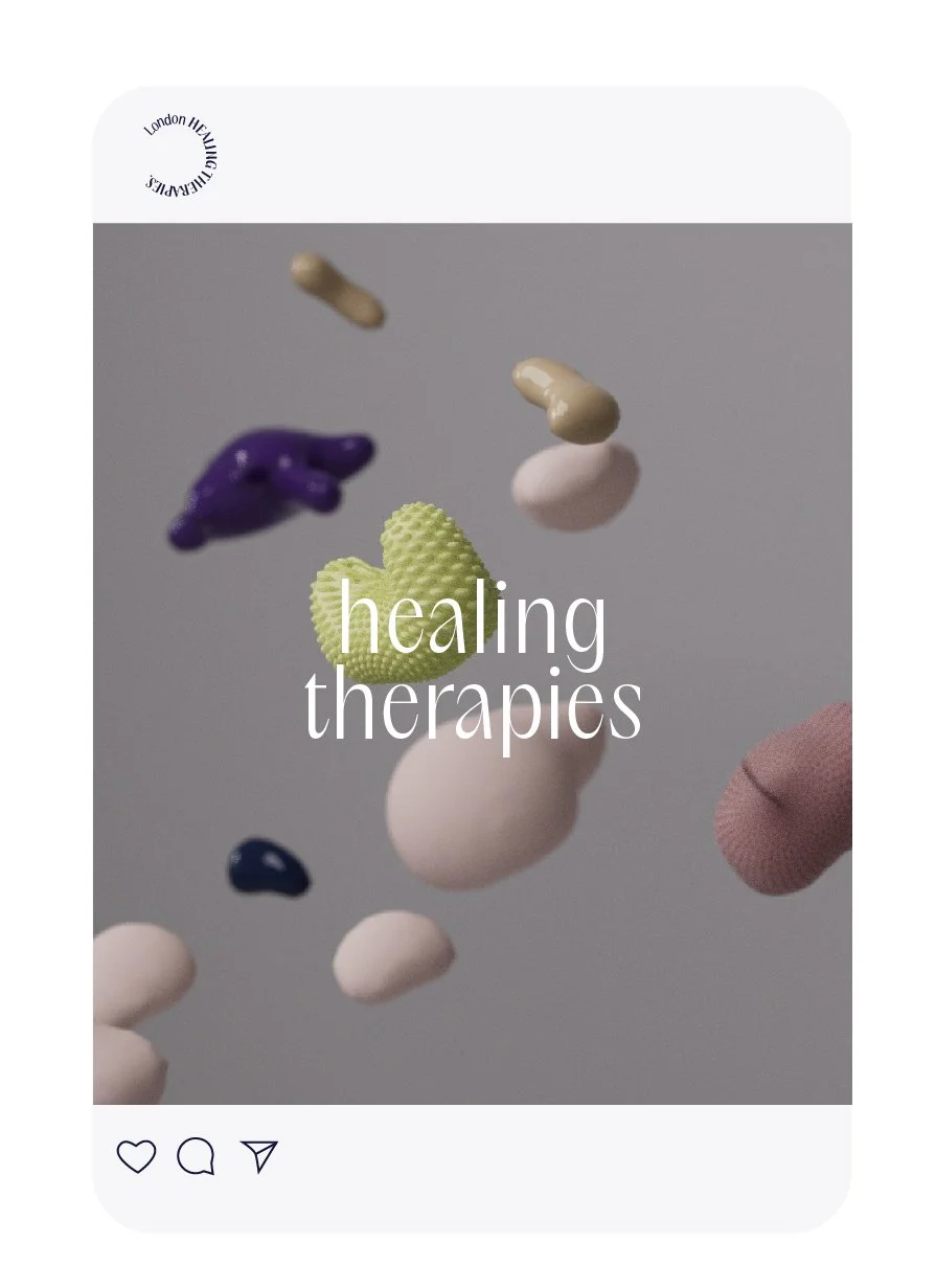
The images are close-up textures and abstract shapes inspired by muscles, ligaments, and fascia, all created to suggest tension and release, discomfort and recovery.
The central concept is based on tendons and body discomfort, exploring how tension, flexibility, and recovery can be translated visually into a design identity.
Tendons represent connection and movement, linking muscles to bones, a metaphor for the brand’s role in connecting people with their physical potential.
These ideas informed not only the brand’s graphic language but also the form, texture, and movement present in all visual materials. The balance between organic imperfection (inspired by human anatomy) and geometric precision (inspired by modern minimalism) became the foundation of the visual identity.
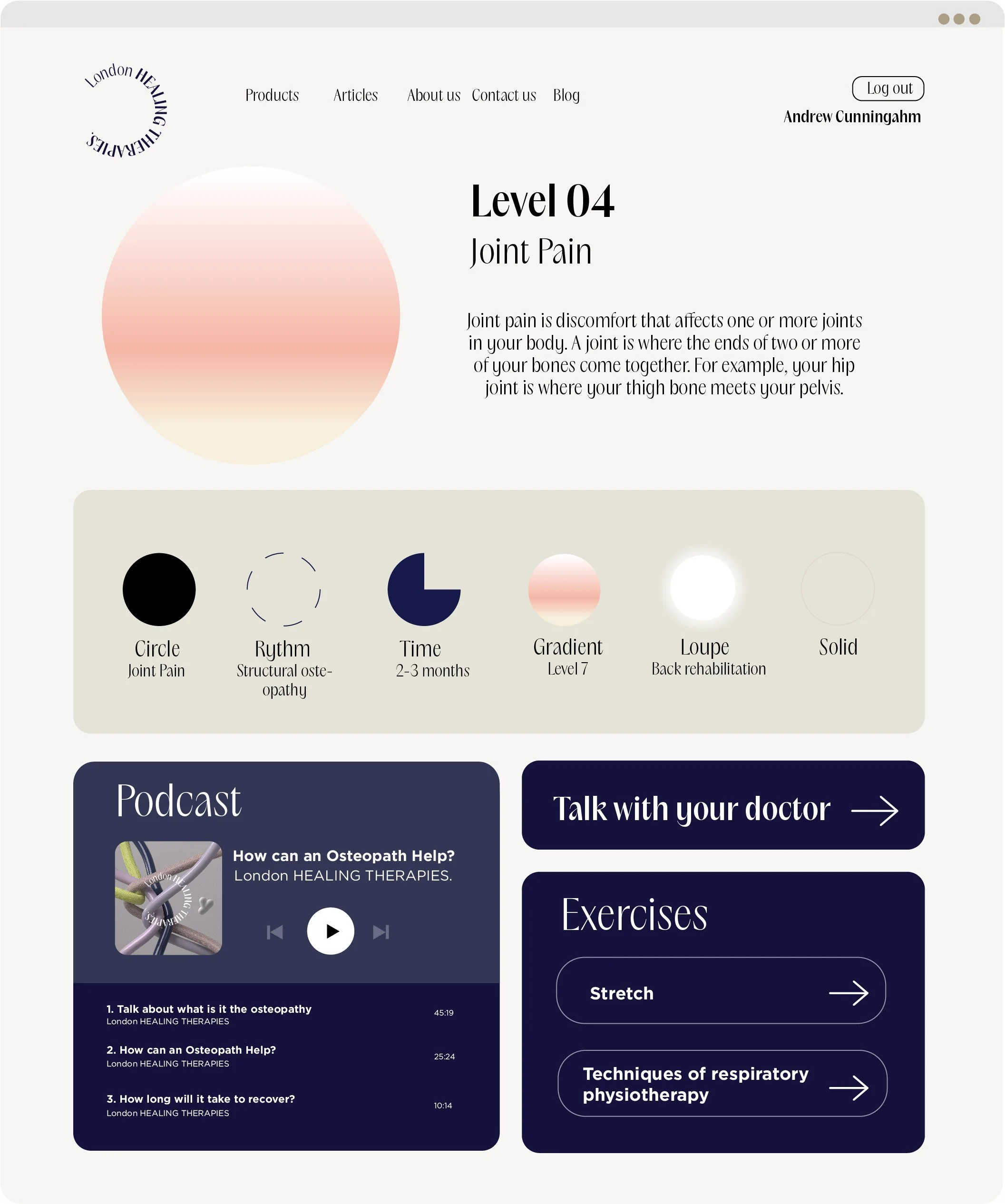
App / website

This section allows visitors to:
Identify areas of pain or discomfort through an interactive 3D body map.
Select specific regions (neck, back, joints, etc.) to receive tailored information about possible causes and recommended treatments.
Understand how osteopathy addresses muscular, skeletal, and postural imbalances, with accompanying visuals and short educational animations.
Book an appointment directly from the diagnosis screen, creating a seamless transition from self-awareness to action.
This feature transforms the site and app from a passive informational platform into an interactive health tool, empowering users to better understand their bodies and take the first step toward recovery.

The navigation is fluid and intuitive, allowing users to explore services, treatments, and the clinic’s philosophy with ease. The design avoids visual noise, favouring slow transitions and smooth scroll animations inspired by the movement of muscles and tendons. Each interaction feels natural — as if the interface breathes with the user’s rhythm.
A key feature of the digital experience is the Diagnosis Section, designed to bring osteopathy closer to the user in a clear, personalised way.


London healing therapies
Brand direction, Art direction, Concept, 3D.