
Arce
DESCRIPTION
Concept, Art Direction, 3D Products, Web Design.
Arce is a self-initiated branding project that explores the creation of a minimalist, contemporary beauty brand. The concept is built around purity, balance, and sensorial elegance, reflecting the calm and sophistication of premium skincare. The brand embodies the idea of “beauty through simplicity” a refined visual language where every element, from typography to form, communicates softness and care.
Logotype

The logotype was designed specifically for Arce, with a distinctive asterisk as its key graphic symbol. This asterisk acts as a signature element representing connection, detail, and subtle distinction. It also evokes the natural radiance of the skin and the idea of small yet meaningful beauty gestures.
Products

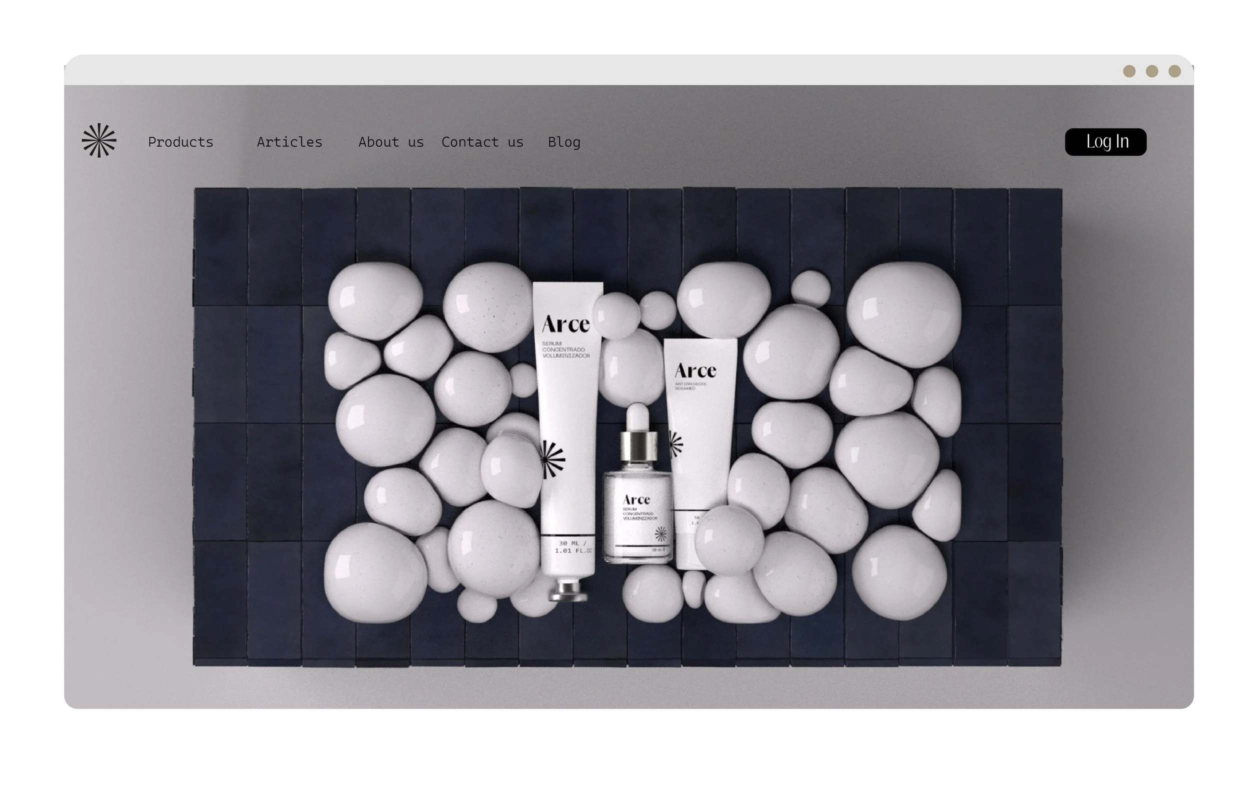
All product visuals were designed and rendered in Cinema 4D. Each cream jar and bottle was modeled to reflect the minimalist and tactile aesthetic of the brand. Materials emulate matte ceramics and soft plastic finishes, giving a realistic and premium impression.
Lighting setups were kept soft and diffuse to highlight smooth surfaces and delicate reflections. Every render captures the product’s quiet beauty, ensuring consistency between still imagery, motion, and digital presentation.


Art Direction
The art direction combines minimalist structure with organic sensitivity, creating a balance between precision and emotion. The visual system is designed to feel refined yet approachable, expressing calmness through visual clarity.


A distinctive feature of the identity is the asterisk, which acts as a recurring visual motif throughout the brand. Integrated delicately across packaging, product renders, and web elements, it serves as a symbol of connection and identity, reinforcing the brand’s visual coherence.
Typography follows a modern sans-serif system, chosen for its geometric clarity and human warmth. The typographic hierarchy supports the minimalist compositions, emphasizing balance, legibility, and quiet sophistication across all brand applications.

The website was designed as a minimalist digital space, echoing the brand’s calm and refined tone. It combines ample white space, smooth scrolling, and animated product renders to create an immersive yet simple browsing experience.
The navigation focuses on clarity allowing the 3D visuals and typography to communicate the identity directly. Additionally, social media imagery and layouts were created to maintain the same elegant, understated language across all platforms.

The colour palette, inspired by blue naïve tones, enhances the brand’s serene and natural personality. This subtle hue introduces a sense of depth and freshness while maintaining the minimalist aesthetic. Clean lines, soft lighting, and generous negative space are used to communicate luxury through restraint, allowing every element to breathe and feel intentional.

Website


Arce
Brand direction, Art direction, Concept, Products in 3D, Web design.