
GRIT
DESCRIPTION
Concept, Art Direction, 3D, Motion, Web Design.
Grit is a conceptual brand created as a reflection of craftsmanship, texture, and authenticity. It presents an exclusive collection of mugs, plates, bowls, and glasses, all produced in small batches. Each piece represents individuality and the imperfect beauty found in handmade design — every curve, grain, and texture speaks of character, patience, and human touch.


Visual identity
The identity of Grit is built around the idea of material honesty, celebrating imperfection, texture, and the natural evolution of form. It’s a brand that doesn’t try to polish away the irregularities of craft; instead, it turns them into its defining aesthetic language.
From the very beginning, the goal was to create a visual system that feels tactile, as if every graphic element could be touched, much like the ceramics themselves.

The Grit logo is designed as a visual translation of the brand’s essence: raw, minimal, and grounded. It represents the balance between imperfection and precision, much like the handcrafted ceramics it symbolises. At its core, the logo expresses two main ideas: Material Authenticity, inspired by clay and stone textures and simplicity of Form, reflecting minimal design and quiet confidence.
The identity rests on three conceptual pillars:
Raw Material (Clay) – symbolising the origin, the foundation of all things handmade. Transformation (Dust) – representing the process, the passage of time, and the residue of creation.Character (Grit) – embodying persistence, individuality, and authenticity. These ideas influenced every part of the visual design, the logo, colour palette, typography, imagery, and motion, resulting in a coherent and sensory experience.

The art direction focuses on minimalism through texture. Rather than relying on bright colours or complex compositions, the visual identity emphasises natural tones, shadows, and tactile surfaces, echoing the feel of raw ceramics.
Colour palette: neutral earth tones, beige, sand, stone grey, and off-white, inspired by the clay materials themselves. The typography: modern sans-serif with soft edges, evoking contemporary craftsmanship.


The imagery features clean compositions, close-ups of textures, and controlled lighting that highlights imperfections as a form of beauty. And the motion direction: slow and elegant, mirroring the rhythm of handmade creation.
The brand’s tone is quietly confident; it communicates quality and design awareness without excess or noise.


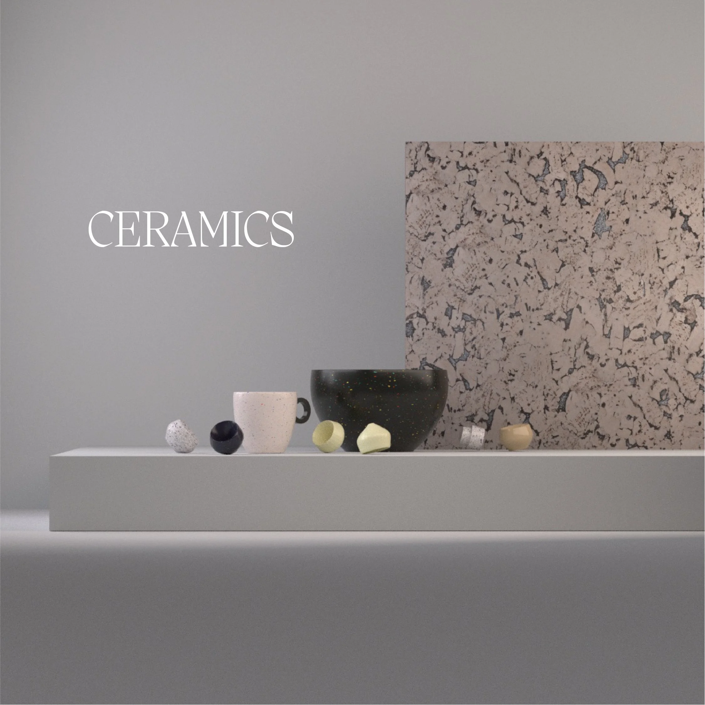

All products were modelled and visualised in Cinema 4D, where the challenge was to recreate the material richness of ceramics in a digital environment.
Using physically accurate shaders and lighting, the aim was to simulate how light interacts with matte and glazed surfaces.
Subtle imperfections were added to surfaces to mimic the handmade look small dents, uneven edges, and subtle texture maps made in Photoshop


Website
The website was designed as a digital gallery, not just an e-commerce page, but an immersive brand experience. The interface follows the same minimalist philosophy: generous white space, soft scroll animations, and muted colour schemes.
3D renders were integrated into the layout, allowing visitors to explore the collection in detail.


The navigation is intuitive, reflecting the brand’s values of simplicity and refinement. The motion and transitions were carefully crafted to evoke a slow, tactile rhythm, mirroring the physical process of pottery.

GRIT
Concept, Art Direction, 3D, Motion, Web Design.